The power of colour is profound. In an often drab and worrisome world, colour can energise and elevate. It can bring joy. And it’s an important element in the architect’s toolkit.
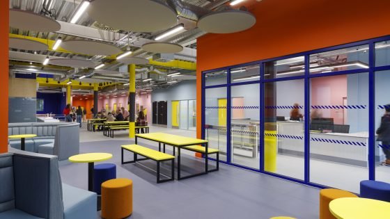
John Puttick Associates’ colourful Preston Youth Zone (or ‘Vault’ as it has been named by the young people who use it) is a case in point. Working with the admirable charity OnSide, this exceptional youth centre is a place to spur creativity, direct energies and inspire positivity. Colour has a key role to play in how the building works and feels for its users.
As Fran Williams writes: ‘Its striking colour palette – developed with Lancaster College of Art-educated designer Ben Kelly, whose legendary 1982 Haçienda nightclub in Manchester for Factory Records has cult status – is all bright shades of orange, yellow and blue, with red used to subtly denote out-of-bounds areas.’
It isn’t a coincidence that colour is particularly good at making community buildings sing
Puttick has worked with OnSide on several occasions (including in Croydon, Blackburn and Grimsby) and in Preston they’ve really pushed their use of colour. It is used deliberately and appropriately: in zoning, for industrial-style columns and diagonal striped fittings and for hard-wearing finishes. It’s a sophisticated approach and one that might be more akin to university buildings. This is a scheme that gives – and expects – a lot.
It isn’t a coincidence that colour is particularly good at making community buildings sing. When budgets are tight, what better way to enliven a crucial retrofit of a much-loved space? In Ryde on the Isle of Wight, for example, home of one of the UK’s oldest carnivals, a team comprising Turner Works and local designers and artists has rehabilitated a derelict Grade II-listed high street store to captivating effect.
A key feature of this project is the vermilion metalwork, which references the original barn structure and the site’s heritage of hardware and ironmongery. ‘The colour and detailing unify structural elements, stairs, ladders, balustrades, handrails, cabinet handles, canopies, signage and gates,’ explains Simon Cadle, associate and project architect at Turner Works. Here, colour is a cohesive language. Perhaps most refreshing are the street façade curtains, developed with local flag artist Liz Cooke, which, as Cadle writes, ‘celebrate the island’s festival culture and create a sense of ceremony between interior and street’.
From Pastel Yellow to Pure Orange to Leaf Green – there is a whole RAL-saturated kaleidoscope of colour to explore in this special issue of the AJ. Deploying colour effectively is a core skill in the architect’s repertoire, and we hope you’ll find much inspiration here.
The March edition of the AJ is out now. Subscribers can read the digital edition here, or copies of the printed magazine can be purchased here. An AJ subscription is better value – click here to view our packages.