








The Pebble Time 2: A Cult Classic Finds New Life in the Open-Source Era
In an era dominated by sleek, locked-down ecosystems and data-hungry wearables, the Pebble Time 2 feels like a defiant, charming artifact of a bygone era. It is a device that refuses to be a generic fitness tracker, demanding instead that its users lean into the process of customization. But for those willing to spend five minutes setting it up, the experience is uniquely rewarding—and surprisingly durable.
A Design That Respects the User
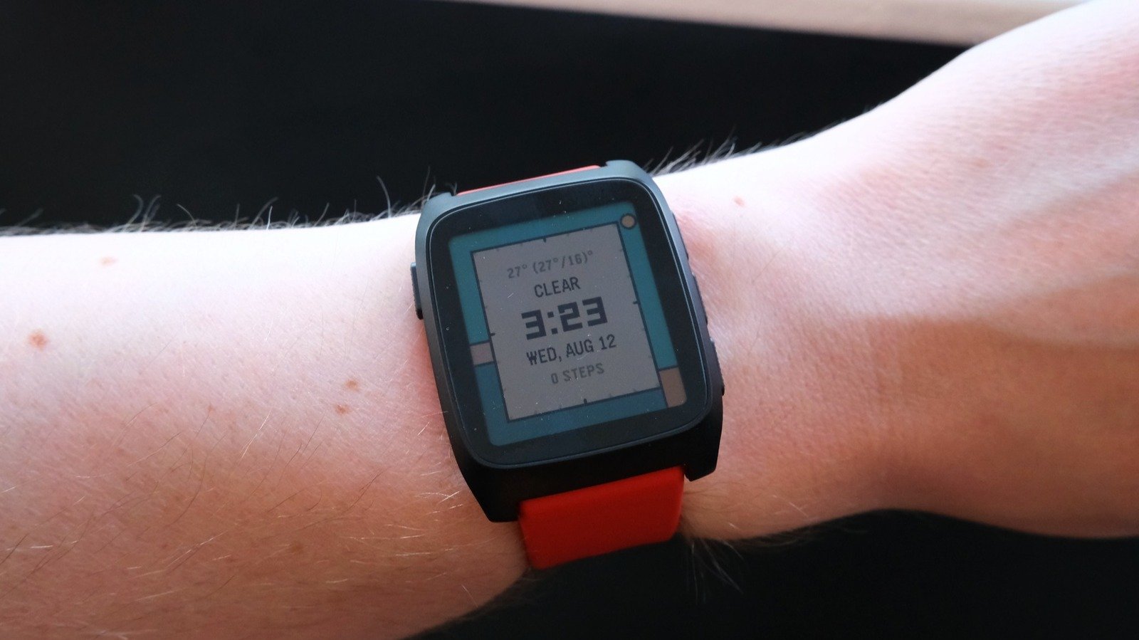
The first thing you’ll notice about the Time 2 is its vertical orientation. Rather than forcing information into a square, Pebble utilized a taller-than-wide display that excels at rendering dense text and intuitive vertical menus. The device doesn’t attempt to cram every notification onto a tiny frame; instead, it leans into the tactile satisfaction of scrolling.
Setup is a journey through an expansive digital archive. Thanks to the legacy of Pebble’s “heyday,” there are thousands of community-made watch faces available. Because of this massive repository, you are almost guaranteed to find a face that fits your specific needs within minutes.
Fitness Without the “Crunch”
Pebble remains steadfast in its claim that this is not a fitness watch, yet it includes all the essentials: step counting, sleep tracking, and a PPG heart-rate sensor. Its approach to data is refreshing; rather than bombarding users with algorithmic scores or unsolicited wellness conclusions, the companion app presents simple, effective graphs. Seeing a week-over-week comparison of your step counts provides a clear, digestible snapshot of your activity without the fluff.
The Open-Source Evolution
Following Fitbit’s acquisition of Pebble—and its subsequent decision to “pull the plug”—the community kept the hardware alive. Today, the project has entered a new phase. Google’s decision to make PebbleOS open-source has allowed the platform to thrive under the “Rebble” initiative.
The result is a software environment that lacks the high-gloss finish of modern Apple or Samsung interfaces but compensates with immense personality. Toggle “Quiet Time” (the device’s DND mode), and you are greeted by an endearing graphic of a tiptoeing mouse—a small, human touch rarely seen in corporate-led software.
The “Kid in a Candy Store” Dilemma
Pebble’s ecosystem is arguably too reliant on its community. While the app store is the hub of the experience, the lack of pre-installed essentials like a stopwatch or a timer feels like an oversight. While installing these from the store is seamless, it forces users to hunt through thousands of third-party apps just to get basic functionality.
For the ambitious, Pebble offers “CloudPebble,” a cloud-based development environment designed to let users create their own apps or faces in under five minutes. Currently, this requires a working knowledge of JavaScript, though CEO Eric Migicovsky has hinted that a WYSIWYG (What You See Is What You Get) interface is on the horizon. For now, non-coders are encouraged to bridge the gap using AI-powered tools like Claude skills.
Room for Growth
Despite its charm, the platform has clear areas for improvement. The companion app often feels disconnected from the watch; simple tasks like configuring “Quiet Time” schedules must be handled on the wrist, rather than through a phone screen. Furthermore, while the device lacks onboard GPS, there is a missed opportunity to better integrate with a smartphone’s turn-by-turn navigation—an area where current third-party solutions fall short.
Ultimately, the Pebble Time 2 is not for everyone. It is for the tinkerer, the minimalist, and the person who appreciates a device that works with them rather than for them. In its open-source state, the Pebble isn’t just a watch; it’s a living project, and one that is arguably easier to live with today than ever before.