









The Evolution of Liquid Glass Interface Design
Apple is currently exploring a return to a more nuanced visual hierarchy within the iOS interface. Recent findings in the iOS 27.3 developer beta reveal that the company is testing a feature that softens the transition between navigation bars and the scrollable content beneath them. By implementing a gradual fade effect, Apple appears to be moving away from the stark, high-contrast boundaries that have characterized recent iterations of the operating system, opting instead for a fluidity reminiscent of design philosophies found in iOS 26.
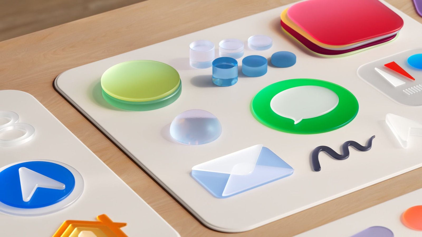
This development centers on the Liquid Glass framework, a design language Apple introduced to bring depth and environmental responsiveness to the mobile interface. The current iteration of Liquid Glass emphasizes uniformity, ensuring that text and data remain legible even when overlaid on translucent backgrounds. However, this uniformity often results in a sharp, definitive line where the navigation bar ends and the application content begins. The newly discovered test feature aims to eliminate that hard edge by introducing a smooth, gradient-based transparency transition that obscures elements as they scroll beneath the top bar.
Technical Mechanics of the Gradual Fade
The mechanism behind this visual adjustment relies on internal feature flags within the iOS 27.3 software stack. According to technical observations, the effect is not a global override but rather a context-sensitive rendering change. It is specifically linked to the Liquid Glass tint intensity settings, functioning only when the transparency slider is set to 25 percent or lower. By restricting the effect to lower transparency levels, Apple ensures that the transition remains subtle and does not inadvertently compromise the visibility of the text behind the glass.
For developers and power users investigating the beta, the feature demonstrates how Apple handles layer compositing. When the flag is enabled, the system changes the alpha-masking process for navigation bars. Instead of a hard clipping path at the bottom of the bar, the software applies a soft-edge mask that decreases the opacity of incoming content more aggressively over a shorter pixel distance. This creates a synthetic atmospheric depth, where the content seems to sink into the interface rather than sliding behind a static pane of glass.
Refining Transparency and User Control
This testing represents the latest step in a broader strategy to refine Liquid Glass. In previous updates to iOS 27, Apple shifted from binary “Clear” and “Tinted” presets to a more versatile, continuous transparency slider. This transition was designed to provide users with specific control over their device’s aesthetics, allowing for a balance between visual depth and high-contrast readability. The introduction of a “softer side” for navigation bars suggests that Apple is listening to feedback regarding the harshness of the current design.
The impact of this update on the user experience is twofold. First, it mitigates the visual jarring that occurs when dense lists or media elements interact with fixed interface components. In current versions, the sharp edge of the navigation bar can create a distracting horizontal line that cuts through images or text. By softening this edge, the interface feels more cohesive and less mechanical. Second, it aligns the mobile interface with the design languages used in macOS and visionOS, which often utilize blur-heavy, layered materials to establish spatial context for the user.
Strategic Implications for iOS Interface Design
The return to a softer aesthetic may signal a shift in Apple’s design roadmap. For years, the company leaned into extreme minimalism, characterized by high-contrast labels and rigid geometric boundaries. While this served the goal of clarity, it often sacrificed a sense of tactile interaction. The potential reintroduction of iOS 26-era design elements, albeit modernized for the Liquid Glass framework, indicates that Apple is seeking to add a layer of complexity back into the digital environment.
This change is particularly significant for applications that rely on long-form scrolling, such as messaging clients, mail applications, and news aggregators. In these contexts, the interface is constantly in motion. A hard boundary creates a strobe-like effect for some users as content crosses the line, whereas a gradual fade provides a smoother, more continuous scroll. By enabling this through an internal flag, Apple is likely gathering data on how these transitions affect eye strain and overall interface perception during high-frequency usage.
Future Prospects for the Interface
As iOS 27.3 remains in its development cycle, it is important to note that the feature is currently hidden from the average user. There is no guarantee that this gradual fade will move from internal testing to a public release. Apple frequently tests granular UI adjustments through feature flags to determine which modifications provide the best balance between aesthetic appeal and functional performance. If the data suggests that users prefer the softer transition—or if it improves the readability of content across a wider range of screen brightness levels—it is likely to appear as a selectable preference or a default behavior in a forthcoming stable release.
Ultimately, this move highlights Apple’s commitment to iterative design. By constantly tweaking the way pixels interact with the underlying hardware capabilities of the display, the company maintains a high level of polish. Whether this update reaches the general public or remains an artifact of the development process, it confirms that Apple continues to prioritize the subtle relationship between the screen’s material properties and the digital information it displays. Users who appreciate the current precision of iOS 27 may welcome this turn toward a more sophisticated and less abrasive visual hierarchy.
Disclaimer: This content is auto-generated for informational purposes only.
Source: Read Original News