






Evolution of the Pixel VIPs Interface
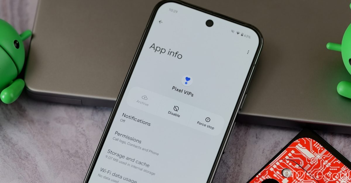
The release of Pixel VIPs 2.0 marks a significant shift in how users interact with their prioritized contacts. Following the latest Pixel Feature Drop, this update introduces a comprehensive redesign of the contact interaction flow. Previously, tapping a contact within the widget triggered a bottom sheet overlay, which functioned as a non-intrusive way to manage communications without leaving the current homescreen context.
Version 2.0 replaces this mechanism with a full-screen layout. While the previous iteration prioritized one-handed navigation by keeping interaction points closer to the bottom edge of the display, the new design centers on providing more surface area for information display. This full-screen transition reflects a shift toward a more immersive dashboard experience for each contact, dedicating the entire screen space to detailed communication history and quick-action buttons.
Refining User Interaction and Visual Design
Beyond the layout shift, Google has streamlined the visual language of the contact page. The most prominent change is the adoption of outline-style iconography for core functions, including calling, messaging, and video conferencing. These icons provide a cleaner, more modern aesthetic that aligns with contemporary design standards.
In addition to these style updates, a new pencil icon has been added to the top-right corner of the interface. This provides a direct gateway to the Google Contacts application, allowing users to edit contact details immediately without navigating through multiple sub-menus. By reducing the number of taps required to reach the editing interface, the update demonstrates a focus on efficiency for users who frequently manage metadata like phone numbers, addresses, or profile photographs for their most frequent contacts.
Reorganized Information Hierarchy
The data architecture within the contact pages has also received a notable adjustment. Google has re-prioritized the information modules displayed on these pages to reflect current user habits. The “Local updates” card has been moved to the primary position, taking precedence over “Last connection.” This indicates a shift in focus toward contextual awareness—providing information relevant to the contact’s current environment rather than simply displaying historical timestamps.
Conversely, the “Notes” section has been relegated to the end of the page, and the platform has discontinued the display of media and location recommendations. By stripping away these secondary features, the interface feels significantly less cluttered. This architectural cleanup suggests an intent to emphasize utility and speed, ensuring that critical communication tools remain the focal point of the user experience.
The New Global Switcher
One of the most functional improvements in Pixel VIPs 2.0 is the introduction of a pill-shaped switcher. This UI component allows users to cycle through their defined list of VIP contacts without returning to the homescreen to select a different widget entry. By enabling persistent access to the entire VIP list from within the contact dashboard, users can jump between different profiles with minimal friction. This utility is particularly effective for power users who maintain large groups of prioritized contacts and need to coordinate communications rapidly across multiple individuals.
Future Widget Enhancements
While the full-screen contact pages are active, the actual widget on the homescreen has not yet received a complete visual overhaul. However, the update includes a preview of what is to come. The upcoming widget design emphasizes “space for quick actions,” which promises to bring the most frequently used buttons—call, text, and video—directly to the homescreen grid.
This design philosophy aims to minimize the need to open the full-screen view for routine tasks. By incorporating these interaction points directly into the home interface, Google is attempting to balance the detailed, full-screen contact management of version 2.0 with the immediate, single-tap execution required for rapid communication. Pixel VIPs 2.0 is currently deploying to devices via the Play Store, and users should expect the final widget visual updates to follow in future incremental releases.
Disclaimer: This content is auto-generated for informational purposes only.
Source: Read Original News