








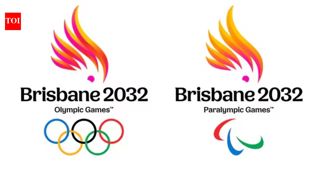
BRISBANE’S road to the 2032 Olympic Games hit an unexpected, high-speed detour this weekend as the local organizing committee found their highly anticipated brand reveal preempted by a digital mishap. In an age where information moves at the speed of light, the Brisbane 2032 committee learned the hard way that even the most carefully choreographed PR campaigns are vulnerable to the human element—or in this case, the “upload” button.
The official Brisbane 2032 YouTube channel, intended to be the grand stage for Monday’s scheduled unveiling, accidentally pushed an “emblem explainer” video live on Friday, three days ahead of schedule. The premature upload featured the full designs in the top-right corner, effectively stripping the mystery away from the upcoming launch and forcing organizers to accelerate their marketing timeline significantly.
## A “Happy Accident” in the Digital Age
While the leak was undoubtedly a source of internal frustration, the Brisbane 2032 committee pivoted with remarkable speed. Rather than retreating into silence, officials leaned into the exposure, officially releasing the designs on social media by Saturday. With a flair for public relations recovery, the committee posted, “Consider this your official reveal,” accompanied by an evocative description of the design’s origins.
Brisbane 2032 Chief Marketing Officer Brent Hill and Olympic and Paralympic Minister Tim Mander took to the podium on Saturday to address the premature release. Rather than offering apologies, they adopted an optimistic stance, framing the blunder as an unexpected catalyst for conversation.
“This is the culmination of a really exciting week,” Mander stated during the press conference. “This is an incredibly exciting milestone as we head to 2032.”
Hill, who spearheaded the marketing efforts, echoed the sentiment, noting that the unintentional buzz had effectively amplified the brand’s reach. “The publicity has been incredible,” he admitted, though he did concede that if the committee could control the clock, they might have opted for a more traditional rollout. “If we had our time over, maybe there’s different ways we could have done it.”
## The Anatomy of the Emblem
Despite the chaotic nature of the reveal, the focus quickly shifted from the technical failure to the aesthetic success of the designs. The logos are a vibrant homage to the Australian landscape and its unique biodiversity, moving away from sterile, abstract shapes toward something deeply rooted in the identity of Queensland.
The Olympic emblem stars a pink cockatoo, a bird synonymous with the Australian inland. The hue of the bird has been masterfully calibrated to evoke the feeling of a burning Olympic flame, seamlessly blending national character with the iconic symbol of the Games. Its Paralympic counterpart features the quintessential sulphur-crested cockatoo, creating a cohesive visual language between the two events.
The committee’s statement emphasized that the designs were “inspired by our reef, beaches, hinterland and everything in between.” The goal, they noted, was to bring together the “places, people, and spirit” that will define the host city’s journey over the next eight years. By utilizing iconic Australian wildlife, the committee has signaled a clear intent to move away from the corporate, cold aesthetics often associated with major sporting events, favoring instead a warmth that reflects the local culture.
## Looking Past the Leak
As the dust settles on this weekend’s digital drama, the focus now turns toward Monday’s original, though now slightly redundant, official unveiling. With the visual identity already in the public eye, stakeholders are wondering what else the organizing committee has in store.
Brent Hill hinted that the accidental video leak was merely a teaser, suggesting that there is more information to come. As the city continues its long-term transformation toward 2032, the logo marks the first major milestone in a decade-long project. While the roadmap for the brand reveal may have gone off-script, the overarching mission remains firmly on track.
The incident serves as a modern-day reminder for all global organizations: in the digital age, control is an illusion. The Brisbane 2032 committee’s ability to pivot from a potential public relations embarrassment into a moment of collective excitement may, in the long run, be an apt metaphor for the grit and adaptability needed to pull off an Olympic Games.
For the people of Queensland, the pink and sulphur-crested cockatoos are now officially the faces of their future. The logos are set to become a permanent fixture on the global stage, appearing on everything from infrastructure projects to athlete apparel as the countdown to 2032 officially intensifies.
While the committee might prefer to keep the “emblem explainer” blooper in the past, the rapid public reaction suggests that the designs themselves are a hit. The bird-inspired branding has injected a sense of local pride and curiosity into the process, proving that even a leaked file can carry the weight of a city’s Olympic aspirations. Whether or not the committee planned for the reveal to happen on a Friday, the fact remains: the 2032 Games are now visible, vibrant, and officially taking flight.
Disclaimer: This content is auto-generated for informational purposes only.
Source: Read Original News