









The New CD Projekt Red Logo Has Sparked the Weirdest Backlash Graphic Design Has Seen
In the world of corporate branding, logo redesigns are almost always met with a chorus of critique. Whether it’s the controversial overhaul of the Twitter bird or subtle tweaks to iconic staples, design changes rarely go unnoticed. However, the latest visual update from Polish game developer CD Projekt Red has triggered a level of outrage that defies logical explanation, pulling a simple graphic refresh into the chaotic heart of modern “culture wars.”
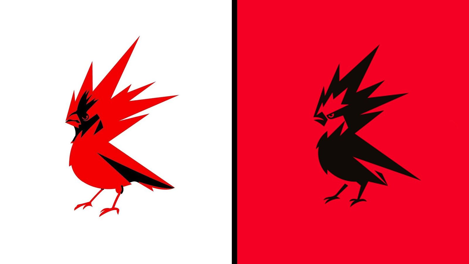
The developer, best known for The Witcher and Cyberpunk 2077, recently updated its long-standing bird emblem. The redesign features sharper lines, an open beak, and more aggressive claws—a deliberate effort to make the studio’s mythological “Raróg” firebird appear more confident and energetic. Despite the design being a clear visual evolution, it has been met with bizarre accusations ranging from “woke” infiltration to political radicalization.
An Evolution, Not a Revolution
For the uninitiated, the CD Projekt Red logo was originally inspired by the Raróg, a fiery spirit from Slavic folklore. Since 2014, the icon had leaned heavily into the aesthetics of the Northern Cardinal. The new version seeks to move away from literal avian representation toward something more abstract and modern.
The studio stated that the refresh was intended to be “more mature, confident, and energetic.” The shift toward a bolder use of red—a color that originally honored the red bricks of the studio’s first office in Łódź—is both visually cohesive and true to the brand’s identity. Yet, to some corners of social media, these design choices were interpreted as a political statement.
The “Woke” Accusations
On X (formerly Twitter), the response was as immediate as it was confusing. Some users dismissed the redesign as being “modernized and DEIfied,” while others claimed the studio had been infected by the “woke mind virus.” Perhaps most strangely, the shift from a white-on-red color scheme to a more dominant black-on-red led some commenters to claim the company was signaling support for the anti-fascist movement, Antifa.
By that logic, major corporations like Netflix or Coca-Cola—both of which utilize similar high-contrast red-and-black palettes—would also be targets for such accusations. The absurdity of the claims highlights how the new CD Projekt Red logo has been caught in a digital firestorm that has little to do with typography or vector paths.
Ignoring the Studio’s Roots
The irony of this backlash is that the rebellious, defiant spirit some claim the logo now lacks is exactly what the studio intended to project from the start. Back in 2014, co-CEO Adam Badowski described the Raróg as a symbol of the studio’s own ethos: “We are rebels, and rebels are free. Just like birds… RED stands for energy, the inner fire that drives us; it represents something very close to everyone here in the studio—the creativity and passion we harness from within ourselves to make the best RPGs in the world.”
While the design has changed to meet the needs of a modern, multi-franchise developer, the underlying symbolism remains anchored in the same Slavic heritage that defined the studio at its inception. CD Projekt remains a publicly traded company on the Warsaw Stock Exchange, operating firmly within a capitalist framework—a fact that seems to have been conveniently ignored by those labeling the design as communist propaganda.
Ultimately, the controversy says more about the polarized state of online discourse than it does about the quality of the design itself. Whether you find the new Raróg sharper or simply different, it is difficult to see the malice that some claim to find in a pair of open wings and a new coat of paint.