









A New Visual Identity Born from Acoustic Engineering
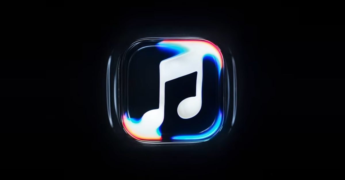
Apple Music has officially unveiled a comprehensive brand refresh, marking the most significant aesthetic shift for the service in recent years. Moving away from purely digital design methodologies, the company has introduced a new visual identity that serves as a bridge between high-fidelity audio and physical manifestation. The update is characterized by a new logo design that deviates from the previous flat, minimalist aesthetic in favor of a more dynamic, textured representation.
The central concept behind this rebrand is the principle that the logo was “made by sound.” Rather than generating assets through algorithmic software or standard graphic design tools, Apple collaborated with producer Fred again.. and the engineers at NEST Acoustics to record the physical impact of sound waves on material matter. This process involved utilizing complex setups where low-frequency vibrations were channeled into physical surfaces, creating patterns and shapes that were then captured via high-speed photography. The result is a logo that possesses an organic, tactile quality, reinforcing the idea that digital streaming is deeply rooted in the physical reality of acoustic performance.
Technical Execution and Practical Photography
In an era where generative artificial intelligence is often the default tool for creative rebranding, Apple’s decision to pursue a practical, in-camera production method highlights a shift toward craftsmanship. The behind-the-scenes documentation reveals that the team utilized specialized transducers and acoustic dampening to translate specific musical frequencies into precise geometric movements.
This approach serves a dual purpose: it grounds the brand identity in tangible physics and provides a unique visual language that stands out in a crowded market of digital-only icons. By relying on real-world refraction and physical material responses to sound, the new logo benefits from light-handling and shadow depth that are difficult to replicate through traditional computer-generated imagery. This technical commitment to practical effects ensures that every iteration of the logo used across Apple platforms maintains a consistency rooted in the laws of motion and acoustics.
Integration within the iOS 27.2 Ecosystem
The rebranding efforts are not confined to promotional materials; they represent a core component of the upcoming iOS 27.2 update. Users will notice that the application interface has undergone a systematic redesign to align with the new visual identity. The update includes a redesigned app icon that features more depth, refined color grading, and improved resolution handling across different display densities.
Beyond the icon, the internal navigation of the Apple Music application has been optimized to match the new design language. This includes subtle animations that mirror the movement captured during the creation of the logo. When transitioning between tracks or exploring library lists, the interface incorporates fluid transitions that respond to the user’s input with a weight and responsiveness that reflects the “crafted” nature of the new brand. For users, this means the software feels less like a static utility and more like an immersive environment designed to accentuate the high-fidelity nature of the audio content being streamed.
The Impact of Branding on Streaming Utility
While a rebrand often focuses on superficial changes, this move by Apple addresses the growing demand for premium aesthetic experiences in the high-fidelity streaming space. As subscription services compete on sound quality, such as Lossless Audio and Spatial Audio, the visual presentation must necessarily communicate a high level of detail and care. By visually aligning the brand with the science of sound, Apple is reinforcing its position as a platform for audiophiles and serious listeners.
Furthermore, the emphasis on practical craft over synthetic design provides a point of differentiation. In the competitive landscape of digital music, where most logos are optimized for small-screen abstraction, Apple’s choice to use real-world textures allows for a distinct visual footprint. This allows the application to feel more premium and physically connected to the recording studio environment, where the music being consumed is actually created. It creates a narrative arc for the user: the journey of a song from a studio speaker to their own device is now reflected in the very icon they tap to open the app.
Future Directions for Design and Interaction
The move to a “made by sound” identity suggests a broader trend in how software interfaces may evolve. As hardware capabilities continue to improve, particularly with respect to display brightness and color accuracy on mobile devices, there is greater room for complex, multi-layered design elements. Apple’s transition to this new branding structure is likely a precursor to further UI developments that emphasize responsiveness and physical-world aesthetics.
As iOS 27.2 rolls out to the broader public, the industry will be watching to see how users interact with the new interface. The success of this rebrand hinges on its ability to balance sophisticated design with functional clarity. If the visual updates successfully communicate the premium nature of the streaming service without hindering navigation, it could signal a shift toward more elaborate, texture-heavy design trends in mobile operating systems. For now, the transition serves as a calculated exercise in marrying engineering with artistic vision, ensuring that Apple Music remains a central, identifiable fixture in the modern digital landscape.
Disclaimer: This content is auto-generated for informational purposes only.
Source: Read Original News