









Apple has initiated a comprehensive visual overhaul for its music streaming service, marking a significant departure from the brand’s long-standing design language. With the arrival of the fourth developer beta for iOS 27.2, users are witnessing a shift toward a monochromatic aesthetic. This transition moves away from the prominent red and pink hues that have characterized the Apple Music interface since its inception, signaling a broader strategy in the company’s design roadmap.
The Shift to Monochromatic Branding
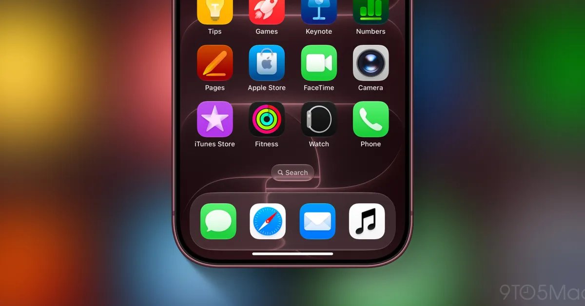
The most immediate change in the iOS 27.2 beta 4 update is the redesigned app icon. Apple has moved toward a high-contrast, black-and-white visual identity. In standard light mode, the icon now displays a sleek black music note logo centered on a white background. Conversely, when the device is set to dark mode, the configuration inverts, presenting a white logo on a black background.
This modification aligns with a broader trend in software design, prioritizing neutrality and system integration over vibrant color blocks. By shedding the specific red palette, the Apple Music icon now mirrors the simplified design philosophies seen across other core system applications, such as the App Store and Calculator, which have undergone their own stylistic revisions in recent iterations of the operating system.
Refining the Interface and Tab Navigation
The visual update extends well beyond the home screen icon. Within the application itself, the navigation experience has been altered to emphasize clarity and focus. The bottom tab bar, previously defined by red or pink highlights to indicate the active section, now utilizes a consistent blue accent. This decision helps to separate the navigational elements from the primary content of the app, creating a clearer hierarchy for the user interface.
These adjustments are intended to reduce visual clutter. By removing color saturation from navigation markers and section icons, the interface allows the user to focus more on album artwork and artist photography. This design choice suggests that Apple is prioritizing the media content itself over the utility of a color-coded navigational system.
Library and Widget Overhaul
The transformation continues into the Library section of the app. Standard menu items—including Playlists, Albums, Artists, and Songs—have been stripped of their former color accents. The list-based interface now adheres to a strictly black-and-white presentation. This shift provides a more uniform look that scales effectively across various device sizes, from the smaller screens of iPhones to the expanded displays of larger models.
Furthermore, the Apple Music widgets have been updated to reflect this new design directive. Where previously the widgets often relied on the iconic red tint to draw the eye, they now feature simplified backgrounds that integrate seamlessly with the user’s chosen wallpaper and system theme settings. This ensures that the widget remains functional and legible without clashing with the personalized aesthetics of the device’s home screen.
Impact on User Experience and Design Consistency
The move to a monochromatic palette serves a dual purpose: it offers a cleaner, more modern look and provides better accessibility for users who rely on high-contrast interfaces. For many, the removal of heavy color branding creates a more cohesive experience that feels like a native extension of the operating system rather than a standalone service that operates under its own set of visual rules.
While some long-time users may find the loss of the signature red branding jarring, the technical implementation suggests a move toward modular design. A black-and-white identity is inherently more flexible, allowing the brand to maintain consistency across various hardware platforms—including future iterations of wearables and home devices—where color reproduction might be limited or where a neutral background is preferred.
Anticipating the Final Release
As the iOS 27.2 beta cycle progresses, developers are closely monitoring these changes to see if the monochromatic theme will extend to other areas of the Apple ecosystem. The current updates in beta 4 serve as a primary indicator that Apple is moving forward with this direction for its music services.
With the official release expected to follow the conclusion of the testing phase, users should prepare for a significant adjustment to their habitual interactions with the app. As Apple continues to integrate these features, the focus remains on streamlining the user experience, enhancing readability, and solidifying a design language that can evolve alongside future software and hardware developments. Whether this transition will be met with widespread adoption depends on how well these high-contrast elements perform in diverse lighting conditions and varied usage scenarios as the update makes its way to the broader public.
Disclaimer: This content is auto-generated for informational purposes only.
Source: Read Original News