









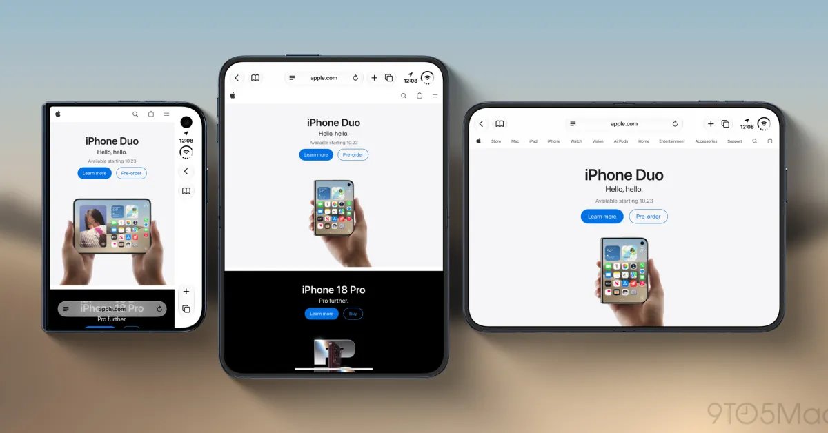
Addressing the Safari Display Constraint on iPhone Duo
The introduction of the iPhone Duo, with its innovative foldable architecture, has brought a new set of challenges to web interface design. Among these, the most prominent concern involves how Safari interacts with the device’s 5.4-inch outer display. Users and critics alike have noted that the browser’s interface, specifically the right-aligned controls, consumes a disproportionate amount of screen real estate. This configuration effectively constricts the viewing area for web content, creating a suboptimal experience when compared to the device’s primary, larger internal display.
Apple has formally acknowledged these limitations as part of the broader release cycle for Safari 27.1. By addressing these design frictions, the engineering team aims to refine the browser’s interaction with non-traditional aspect ratios and screen geometries. The current browser implementation defaults to a conservative layout to ensure that navigation tools remain reachable, but this comes at the cost of immersion and information density for the end user.
The Complexity of Full-Width Web Design
During a recent technical update regarding WebKit, Apple’s development team discussed the difficulty of simply forcing websites to ignore browser controls. While developers are familiar with the viewport meta tag, specifically the use of viewport-fit=”cover” to expand content into safe areas, this approach is insufficient for the unique hardware layout of the iPhone Duo.
The primary danger of applying a universal “cover” setting is the potential for critical content to be rendered underneath the fixed interface elements of the browser. If a website’s header or navigation is inadvertently placed behind the Safari controls, those elements become inaccessible to the user. Because web development standards vary significantly across the internet, a one-size-fits-all enforcement could inadvertently break the usability of millions of sites that were not specifically designed for the idiosyncratic layout of a narrow, folding outer screen.
Evaluating Potential Technical Solutions
Apple’s approach to solving this problem involves more than just CSS overrides. The team is currently evaluating how to provide developers with granular control over the browser’s “chrome”—the non-content parts of the interface. This could involve new media queries or browser-specific environment variables that inform a website whether it is currently occupying the restricted space of the outer display versus the expansive canvas of the unfolded state.
By providing better metadata about the folding position and screen status, Safari could enable designers to dynamically adjust their layout. For instance, a website might shift its branding to the left when the phone is closed, while keeping its core navigation menus clear of the right-aligned touch zones. The challenge lies in creating a robust standard that remains backward compatible with existing web practices while being forward-looking enough to handle future device form factors.
Engaging the Developer Community
Recognizing that this problem spans a vast ecosystem of diverse web design practices, Apple has issued a call to action for the developer community. Instead of imposing a rigid proprietary fix, the WebKit team is seeking input on how to implement a standard that is both secure and flexible. This indicates a shift toward a collaborative design process, ensuring that the final implementation serves the needs of web content creators while maintaining the browser’s high standard for user experience.
Developers are encouraged to test their sites against the current behaviors observed in Safari 27.1 and report instances where content collision occurs. This feedback is essential for identifying edge cases that Apple’s internal testing might miss. The goal is to develop a solution that is “foolproof”—a system where developers can easily opt into a full-width experience without needing to manually account for every possible screen state or overlap scenario.
The Future of Responsive Web Design on Foldables
The effort to optimize Safari for the iPhone Duo is a significant milestone in the evolution of responsive web design. As foldable hardware continues to penetrate the market, browsers must move beyond the static viewport definitions of the last decade. The work being done by the WebKit team represents a fundamental shift in how browsers communicate their geometry to the websites they host.
While the current limitation is a point of contention for early adopters, the ongoing investigation suggests that a more integrated and visually cohesive experience is imminent. By fostering a dialogue between browser engineers and web developers, Apple is laying the groundwork for a web that is as fluid and adaptive as the hardware it runs on. For users, this means that future updates will likely bring a more seamless transition between the outer and inner displays, eventually rendering the current screen-space trade-offs a thing of the past.
Disclaimer: This content is auto-generated for informational purposes only.
Source: Read Original News