








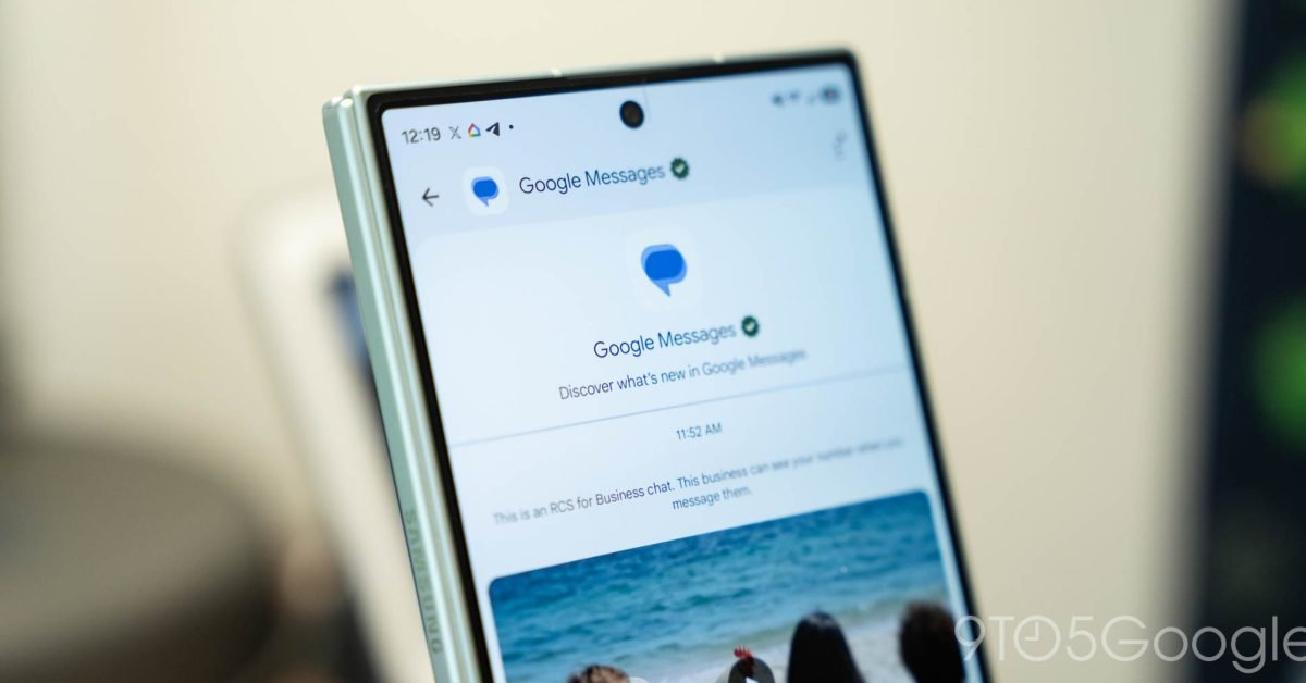
Google is currently testing a significant visual overhaul for its Messages application, focusing on the homepage interface. These changes, which have begun appearing for select users in the beta channel, reflect a shift in how the application manages pinned conversations and navigation accessibility. These adjustments aim to streamline the user interface while aligning with modern design language observed in other mobile messaging platforms.
Elevating Pinned Conversations
The most prominent change in the latest test involves a complete redesign of how pinned chats are presented. Historically, pinned conversations have appeared as a row at the top of the standard message list, retaining their preview text and timestamp. Under the proposed update, Google is experimenting with a layout that detaches these chats from the main list entirely.
Instead of integrating them into the existing conversation stream, pinned contacts are now displayed as larger, circular avatars near the top of the application. This aesthetic mirrors the approach taken by platforms like iMessage on iOS. While this configuration creates a clean, dedicated space for prioritized contacts, it does introduce a trade-off: the removal of text previews and status information. Users will no longer see the last sent message or the time of the previous interaction for these pinned chats from the home screen, requiring a direct tap to view the latest correspondence.
Redefining Search and Navigation
In tandem with the changes to pinned chats, Google is testing a refinement of the search and “Start chat” functionality. The current iteration of the application features a search bar integrated into the header. In the testing phase, this is being replaced by a dynamic, floating action button (FAB) system.
This new configuration places a floating button at the bottom of the screen, which shifts its state based on user activity. When the user is stationary on the homepage, the button appears as a dual-component pill, combining a magnifying glass icon for search with a clear, text-labeled “Start chat” area. As the user scrolls through their message history, the interface adapts; the button intelligently transitions into a compact, pill-shaped “Search” icon while minimizing the primary chat function. This design choice appears optimized for single-handed device usage, positioning essential navigation tools within easy reach of the thumb.
Enhanced Visual Fluidity
The transition animations accompanying the new floating action buttons are noteworthy for their responsiveness. The shift between the expanded state and the minimized search state displays smooth transitions, providing a sense of cohesion to the interface. This shift toward motion-oriented UI design ensures that the application feels active and responsive to user input. By utilizing a pill-shaped container, the application maintains a consistent visual hierarchy that separates primary navigation from the main body of the message list.
Design Strategy and User Impact
The rationale behind these changes seems to be two-fold: improving ergonomics and creating a distinct separation between different types of interaction. By moving search to a floating button, Google is reclaiming vertical space at the top of the app, which is now utilized for the high-priority, avatar-based pinned chat section.
For heavy users of the platform, the primary impact will be a cleaner home screen that highlights specific people rather than the most recent messages. While the loss of message previews for pinned contacts might be considered a disadvantage for those who rely on quick status updates, the benefit lies in a reduced visual load. The interface becomes less dense, allowing for a faster identification of primary contacts.
Implementation and Future Outlook
These updates are currently limited to the beta channel, meaning they are not yet accessible to the general user base. Google frequently utilizes these testing periods to gather feedback on layout changes before committing to a wide-scale release. It remains to be seen whether the current implementation of the Gemini integration—the AI-powered chatbot access—will be modified or removed to accommodate this new floating button layout.
As Google continues to iterate on the Google Messages framework, these refinements suggest a push toward a more standardized, icon-driven mobile experience. Users who are currently part of the testing group may see these changes revert or evolve as the development team evaluates the data regarding navigation efficiency and user preference. For now, the experiment serves as a clear indication that the company is prioritizing interface simplification and improved reachability for its primary messaging tool.
Disclaimer: This content is auto-generated for informational purposes only.
Source: Read Original News