










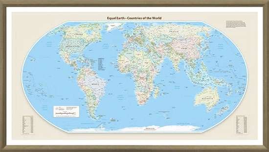
For generations, the world map hanging in classrooms and offices across the globe has been a silent architect of our perceptions. We have long accepted the visual hierarchy dictated by the Mercator projection—a 16th-century cartographic tool that stretches landmasses near the poles while shrinking those near the equator. But a quiet, structural revolution in map-making is finally correcting these colonial-era distortions, promising a more accurate reflection of our planet’s true proportions.
The discrepancy is staggering: under the traditional Mercator model, Greenland appears to rival the massive continent of Africa in size. In reality, Africa is approximately 14 times larger than Greenland. Similarly, India often appears visually eclipsed by northern nations, despite being a sprawling landmass that covers over 3.2 million square kilometers. These persistent distortions have fueled a skewed worldview, subtly shaping how we perceive power, geography, and global connectivity.
Cartographers and educational institutions are now spearheading a global shift toward the Gall-Peters projection and other equal-area maps. Unlike their predecessors, these modern representations prioritize the accurate sizing of continents, allowing for a perspective where the relative scale of landmasses remains true to reality. The transition is not merely a technical update; it is an effort to decolonize the way we visualize our shared environment.
“The map we have used for centuries was designed for navigation at sea, not for an accurate understanding of our global community,” says Dr. Aris Thorne, a senior geographer involved in the initiative. “By prioritizing the preservation of shapes at the expense of area, the Mercator projection inadvertently elevated the importance of northern regions while literally pushing the Global South to the periphery. Correcting this is a fundamental step toward geographic literacy.”
The shift is gaining momentum as digital platforms integrate interactive, dynamic mapping tools. These technologies allow users to “drag and drop” countries across the globe, instantly revealing how a nation’s size fluctuates depending on its latitude. This digital democratization of geography has shattered the myth of the “giant” Greenland and restored the true, immense scale of continents like South America and Africa.
While the Mercator projection will likely remain in use for specific marine and aerial navigation tasks due to its ability to preserve angles, its dominance as the standard classroom reference is ending. As new, more equitable maps find their way into textbooks and digital interfaces, the world is beginning to look fundamentally different. It is a subtle change, yet one that carries profound implications. When we finally see the world as it truly is—rather than how it was drawn for 16th-century sailors—we start to understand our place within it with newfound clarity. The next time you open a map, look closely; the world is much larger, and far more balanced, than you were taught to believe.
Disclaimer: This content is auto-generated for informational purposes only.
Source: Read Original News