









A Discrepancy in Orbiting Typography
The Space Shuttle program remains a pinnacle of human engineering, representing decades of rigorous testing, precise calculations, and strict adherence to technical standards. NASA’s graphic and typographic guidelines were no exception to this culture of precision. Specifically, the agency utilized Helvetica Medium for all exterior markings on the orbiter fleet. This font choice was intended to ensure clarity, uniformity, and professional aesthetics across the vehicles that defined the space exploration era.
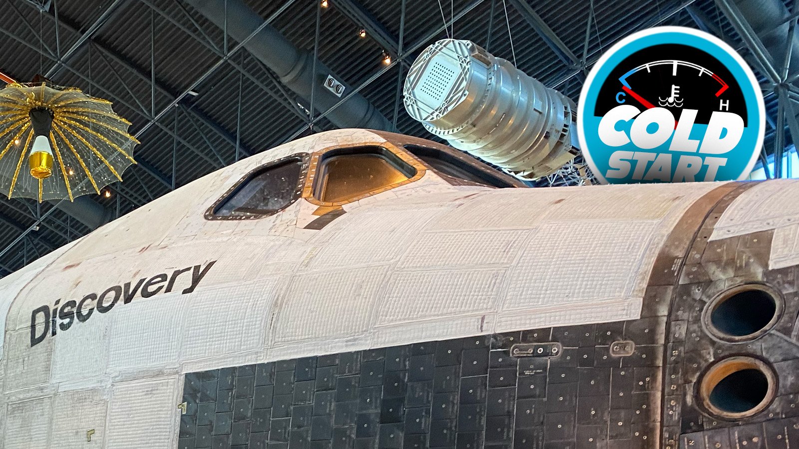
However, recent observations have revealed a fascinating deviation from these standards on the orbiter Discovery. Discovered through social media analysis and subsequently confirmed by examining archival imagery, the letter “s” on the starboard side of the name “Discovery” appears to be rotated 180 degrees. This typographical anomaly, hidden in plain sight for 27 years of active service, challenges the assumption of absolute perfection within the space program’s branding.
The Technical Geometry of Helvetica
To understand why this error stands out, one must examine the construction of the letter “s” in the Helvetica typeface. Helvetica is a neo-grotesque sans-serif font designed for high legibility. Its design features subtle balancing; specifically, the bottom curve of the lowercase “s” is slightly wider and more substantial than the top curve. This visual weight provides the letter with a sense of stability on the baseline.
When a stencil for an “s” is rotated 180 degrees, the wider, more stable section is moved to the top. The top terminal, typically thinner and more delicate in the standard alignment, becomes the base of the character. While the difference is subtle to a casual observer, for those familiar with typographic anatomy, the character appears top-heavy and inverted. This inversion disrupts the intended visual balance of the typeface, creating an unintentional point of visual friction on the fuselage of the orbiter.
Manufacturing and Stencil Application
The application of nomenclature to the Space Shuttle orbiters was a complex process. Given the extreme thermal conditions the vehicles encountered during re-entry, markings could not simply be printed or applied via standard vinyl adhesive. Instead, NASA employed specialized, heat-resistant, space-grade paints applied through large, manually positioned stencils.
The curvature of the shuttle’s fuselage, known as the mold line, further complicated these operations. Technicians were tasked with aligning large-format lettering across non-planar surfaces. It is highly probable that the inverted “s” was the result of a simple human error during the stencil application process—a single orientation mistake that was likely overlooked during final inspections. Given the technical complexity of the refurbishment cycles between missions, such a minor cosmetic detail would have remained a low priority for maintenance crews focused on critical flight-readiness systems.
Discovery: The Reliable Workhorse
Discovery holds a unique place in the history of the Space Shuttle fleet. It served as the most active orbiter, completing 39 missions and spending a cumulative year in space. Its legacy includes the deployment of the Hubble Space Telescope and critical assembly missions for the International Space Station. Because of its longevity and performance, Discovery is perhaps the most photographed and scrutinized of all the orbiters.
The fact that this graphical error persisted for the duration of the orbiter’s operational life—and even throughout its transition to a museum exhibit at the Udvar-Hazy Center—highlights a human dimension to space exploration. It serves as a reminder that even the most advanced technological systems are products of human labor. While NASA’s engineering teams maintained impeccable standards for propulsion, life support, and structural integrity, the mark of a human hand remains visible in the minor imperfections of its finish.
The Impact of Subtle Imperfections
In the context of industrial design, errors often lead to immediate correction. However, the survival of this inverted “s” over decades invites a different perspective. Some observers might view the anomaly as a flaw in the adherence to the NASA Graphic Standards Manual. Others, however, see it as a mark of character. Discovery’s identity was defined by its missions, its technical triumphs, and the grit it accumulated while navigating the vacuum of space.
For enthusiasts of both typography and aerospace history, this discovery serves as a cautionary tale about observation. Despite thousands of hours of inspection by engineers, astronauts, and historians, the error went largely unnoticed. It underscores the phenomenon of “inattentional blindness,” where observers become so focused on the grandeur of the machine that they fail to register the specific details of its livery. The inverted letter does not diminish the stature of the orbiter; rather, it provides a unique historical marker that serves as a testament to the reality of the people who maintained these craft.
Ultimately, the error on Discovery demonstrates that even the most stringently regulated technical programs are not immune to the small, strange, and enduring mistakes that define human activity. Whether through an oversight by a technician or a lack of concern by management, the upside-down “s” stands as a subtle, permanent quirk in the history of spaceflight.
Disclaimer: This content is auto-generated for informational purposes only.
Source: Read Original News