








The Evolution of Precision: Decoding the Panda Chronograph
In the world of horology, the transition from prototype to mass production is rarely a seamless journey. It is a process fraught with engineering constraints, aesthetic debates, and the rigorous demands of the marketplace. Recently, a specific development in the chronograph sector has sparked a discourse among collectors and engineers alike. At the heart of this discussion is a timepiece that captured the imagination of the watch community during its exhibition phase, only to undergo a subtle yet significant transformation before reaching the consumer market.
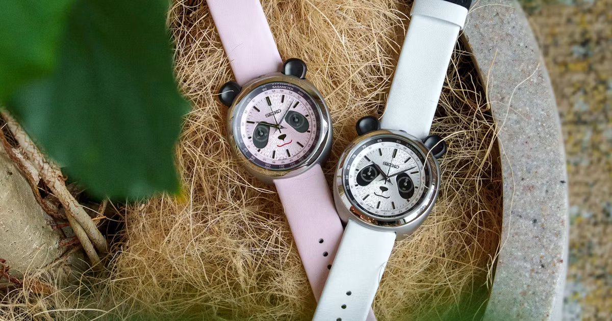
The watch in question, widely referred to as the “Pandagraph” during its development phase, represented a convergence of whimsical branding and technical precision. The name itself was a masterstroke of design philosophy—a portmanteau merging the visual cues of a high-contrast panda dial with the mechanical complexity of a chronograph. For many enthusiasts, the name was not merely a label but an identity that defined the character of the piece. However, as the device moved from the concept workbench to the assembly line, the manufacturer made a calculated pivot, replacing the explicit nomenclature with a more abstract, visual shorthand.
Bridging Technical Function and Aesthetic Minimalism
The core of the recent design update involves the six o’clock position on the dial. In the initial exhibition model, this area prominently featured the word “PANDAGRAPH.” This branding choice served a dual purpose: it identified the unique architecture of the watch and signaled a departure from traditional, austere luxury naming conventions. It was playful, technically descriptive, and culturally resonant.
In the final production iteration, the brand opted for a visual substitution. The text has been replaced by a stylized graphic representation of a smiling mouth. From a design standpoint, this shift reflects a move toward minimalism and a reliance on symbolic communication over literal text. By utilizing the negative space and geometric symmetry of the sub-dial configuration, the designers have effectively integrated the brand identity into the dial’s iconography rather than layering it on top as typography. This move suggests an evolution in how brands perceive the intelligence of their consumer base; there is a clear intent to allow the watch to speak through its design elements rather than through explicit labeling.
Mechanical Integrity and Dial Architecture
Beyond the debate surrounding the dial typography, the watch remains a formidable example of contemporary chronograph engineering. At its heart, the movement emphasizes high-frequency oscillation, ensuring that the timekeeping functions remain accurate under various conditions. The “panda” configuration—characterized by high-contrast sub-dials set against a lighter main dial—is more than just a stylistic preference. It is a functional requirement for readability in high-stress environments.
The sub-dials at the three, six, and nine o’clock positions are arranged to provide instant legibility. The replacement of the text with the mouth graphic at the six o’clock position does not compromise the utility of the dial. Because the chronograph elapsed-time counter usually resides in this register, the design team had to ensure that the new graphic did not clutter the indices or interfere with the sweep of the hand. By simplifying the visual landscape of the six o’clock sub-dial, the engineers have arguably improved the legibility of the totalizer hand, as there is less typographical noise to distract the eye during a rapid reading of elapsed minutes or hours.
The Impact of Iterative Design on Market Perception
When a product undergoes a design change between its announcement and its release, the impact on the user base can be profound. The “Pandagraph” moniker carried a certain weight, setting an expectation of something unique and bold. By removing that text, the brand has shifted the focal point of the watch from its name to its inherent geometry. This change is reflective of a broader trend in luxury goods: the move toward “quiet design.”
For the collector, this transition offers an interesting study in manufacturing history. Models that retain the early prototype branding or text are often viewed as historical artifacts, while the production model is seen as the refined, finalized standard. This creates a tiered valuation system where the mechanical performance remains constant, but the cultural value fluctuates based on the specific iteration of the dial. It highlights the importance of the production process, where engineers must balance the desire for narrative branding with the pursuit of a clean, timeless aesthetic.
Balancing Legacy with Modern Manufacturing
The shift from the “PANDAGRAPH” text to the mouth graphic also underscores the challenges of scaling production. Textual elements on a watch dial are notoriously difficult to print with consistent clarity across thousands of units. Each letter requires precise alignment, ink thickness, and font integrity. A graphic element, while still requiring precision, can be more easily standardized during the printing process, reducing the potential for manufacturing defects and improving yield rates.
This decision likely saved time and costs in the assembly stage while simultaneously creating a more enigmatic and engaging visual hook. Rather than reading a name, the user is invited to interact with a character that emerges from the dial’s layout. This change is not necessarily a step backward, but rather a maturation of the product’s identity. As the horological industry continues to move toward more integrated, self-referential design languages, we can expect to see more brands favor iconographic representations over traditional labeling. The transition of this specific model serves as a benchmark for how modern manufacturers are navigating the delicate balance between nostalgia, branding, and pure functional design.
Disclaimer: This content is auto-generated for informational purposes only.
Source: Read Original News